Bootstrap Grids
 25 Sep 2019
Bootstrap Grid System
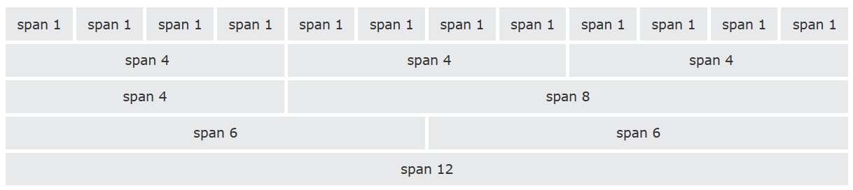
Bootstrap's grid system allows up to 12 columns across the page.
If you do not want to use all 12 columns individually, you can group the columns together to create wider columns
Bootstrap's grid system is responsive, and the columns will re-arrange automatically depending on the screen size
Grid Classes
The Bootstrap grid system has four classes
xs(for phones - screens less than 768px wide)sm(for tablets - screens equal to or greater than 768px wide)md(for small laptops - screens equal to or greater than 992px wide)lg(for laptops and desktops - screens equal to or greater than 1200px wide)
The classes above can be combined to create more dynamic and flexible layouts.
Aenean lorem odio, mollis sed consequat et, pellentesque id purus. Nunc sagittis malesuada urna, ultricies lacinia nisi varius vitae. Aliquam sit amet egestas sapien, nec mollis quam.